
Paradox Styling: Stop Matching
A case for friction in modern style.

We were taught that style is harmony. Match your metals. Coordinate your palette. Build a “cohesive” look.
But the outfits that actually stop you usually have a little disagreement in them. Something sharp next to something soft. Something polished next to something lived-in. That contrast is what makes the look feel alive.
I call this Paradox Styling. It’s not a trend, it’s a modern styling shortcut.
The Off Note
Add one thing that technically shouldn’t belong, and make it belong. The “off” note that makes the whole outfit work.
I used to be more matchy-matchy. Then I started noticing the looks I saved had the same trick: a puffer over a silk dress, a chunky boot with something refined. One practical piece against one delicate. A little friction, on purpose.
The Modern Juxtaposition
Modern style lives in the space between extremes. The point isn’t matching, it’s contrast. (None of this is new; I’m just naming the pattern so you can use it on purpose.)
There are a few reliable ways to create it:
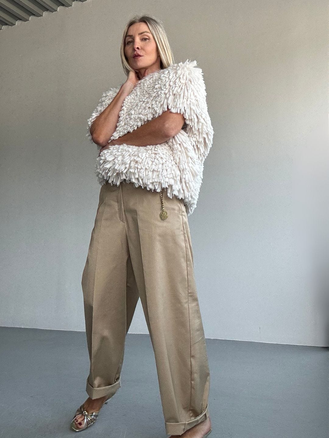
1) Texture tension
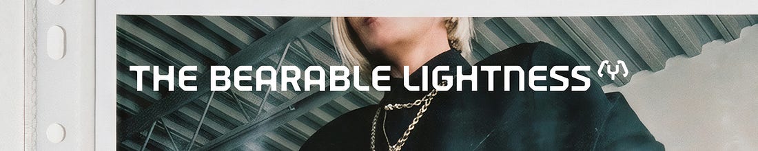
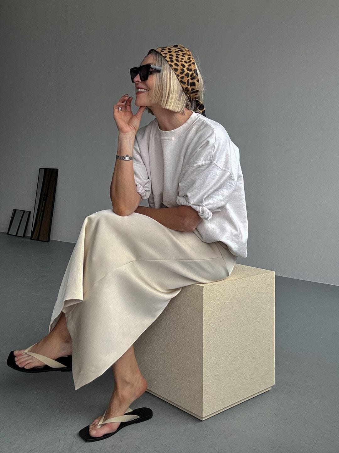
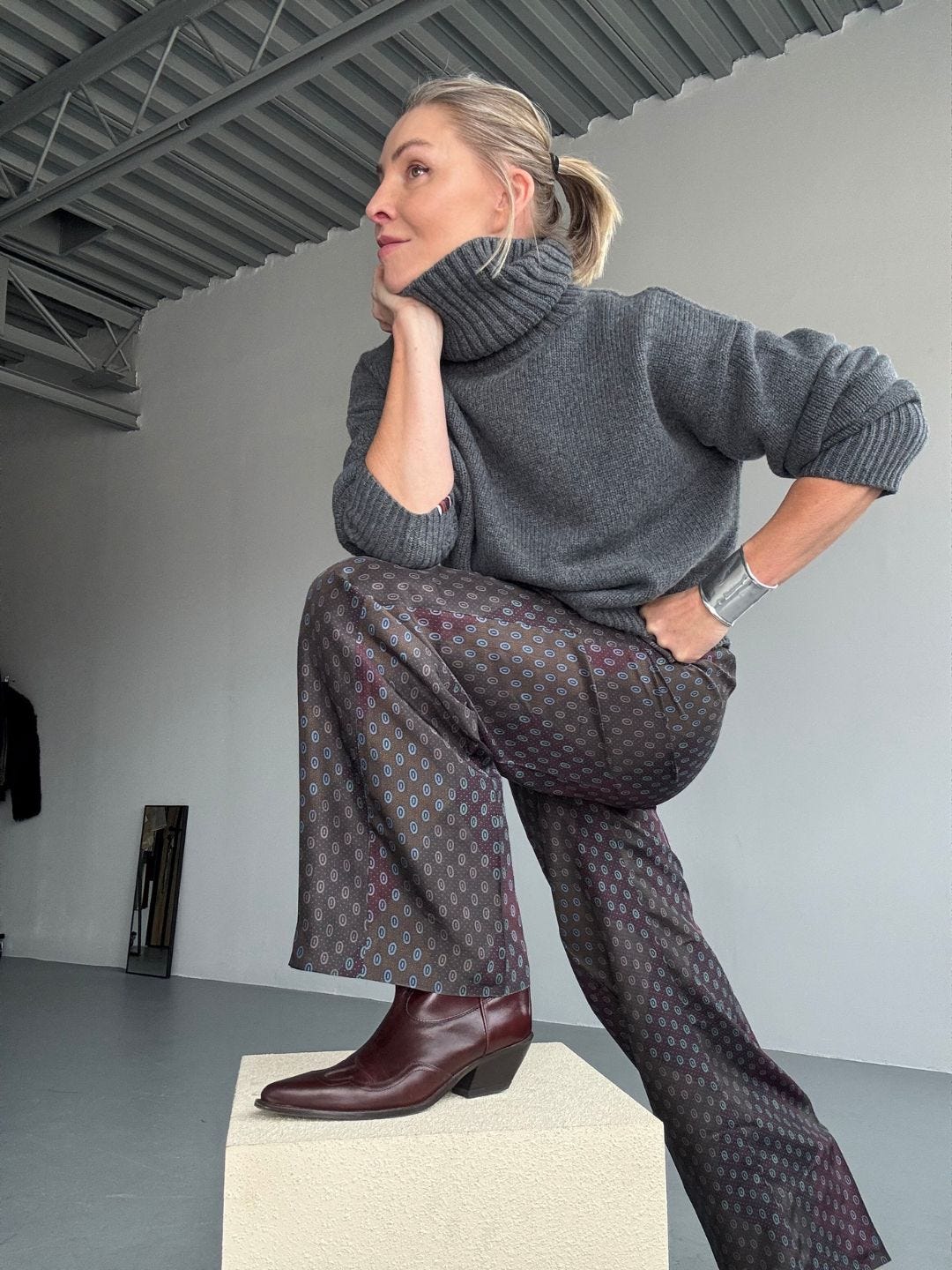
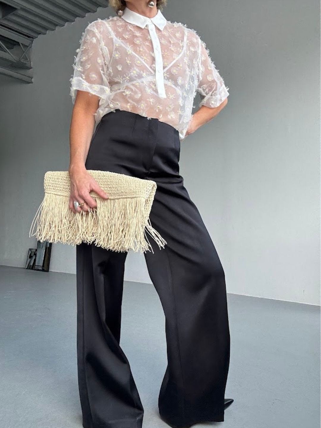
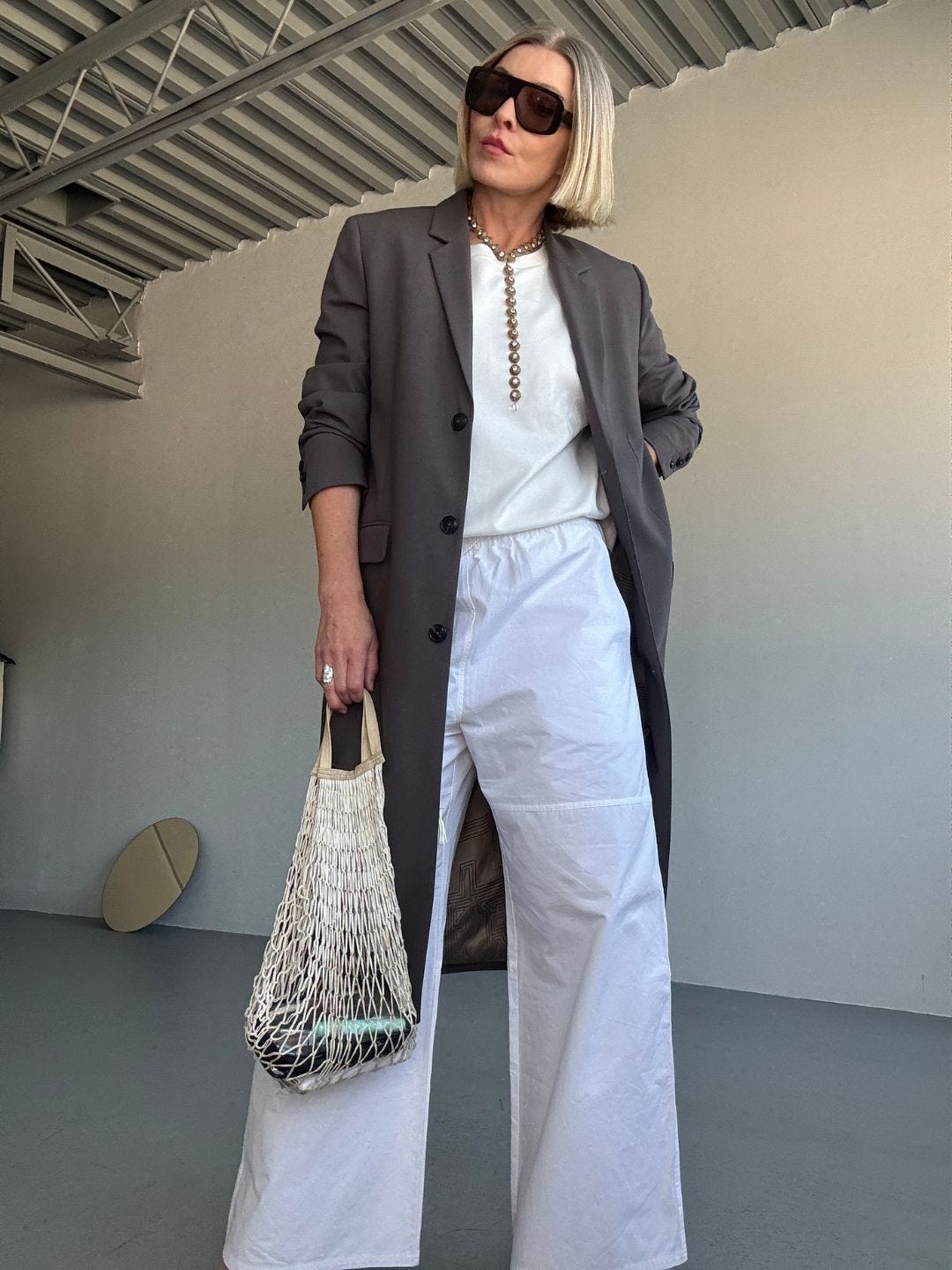
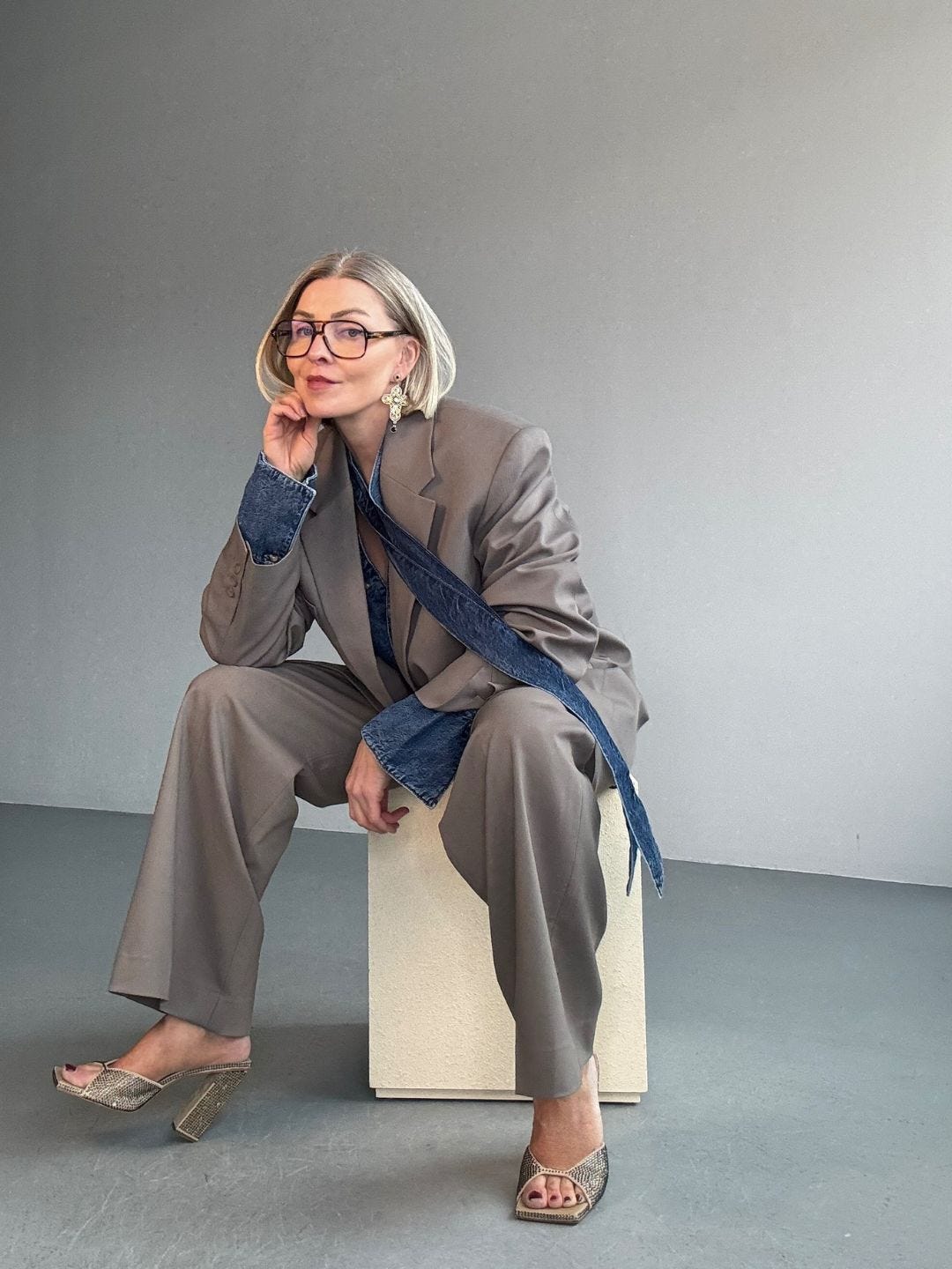
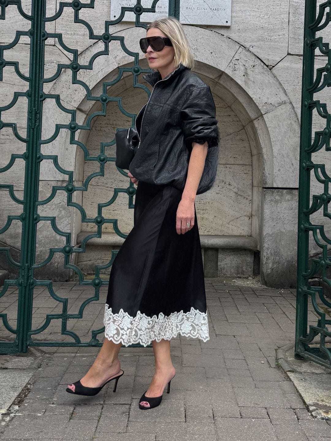
Silk with wool. Satin with denim. Cashmere with leather. A silk dress with a wool sock is a perfect example, the friction is the styling.
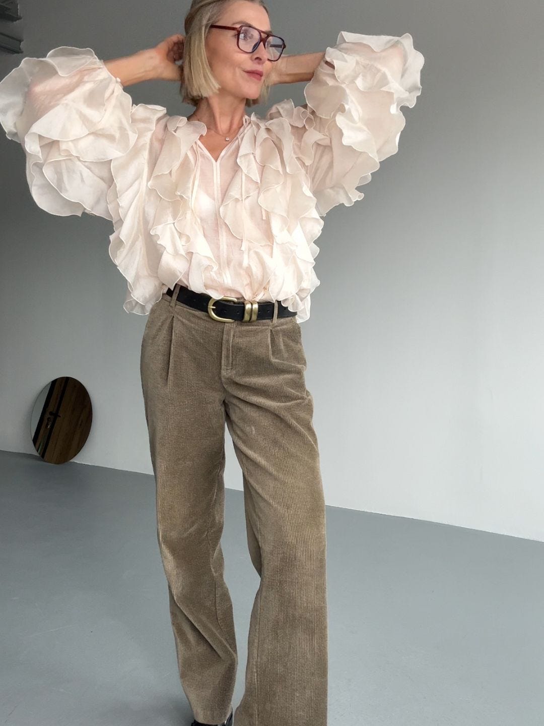
2) Category tension
Pieces from different “worlds” in the same outfit. Feminine-masculine. A tuxedo blazer over a lived-in hoodie. A biker jacket with a romantic skirt. A pencil skirt with a sweatshirt.
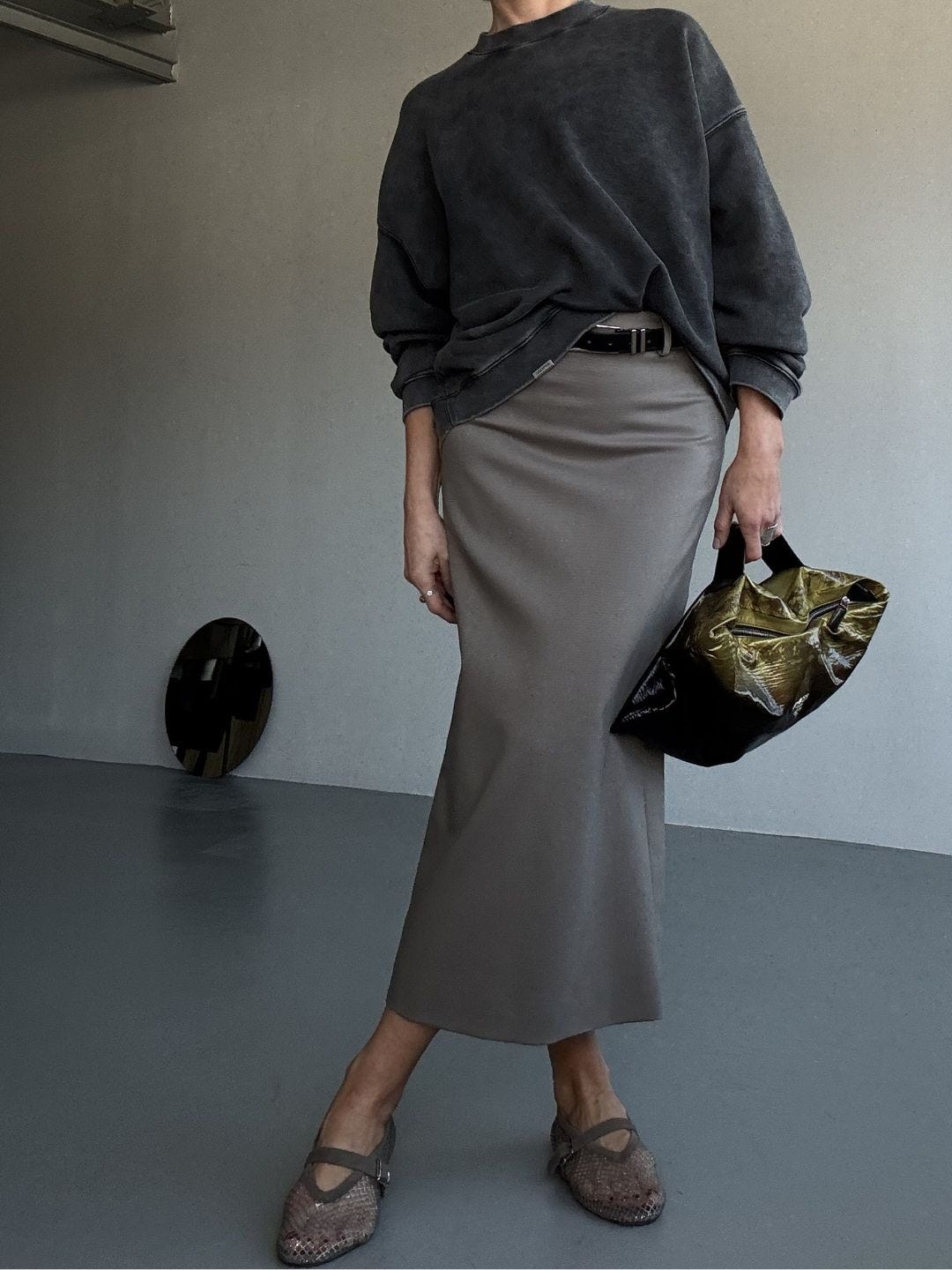
3) Coordination break
Skip the matching set - color-matched bag and shoe, perfectly coordinated accessories. Keep the base simple, then add one “wrong” choice on purpose.
I usually align hardware (belt/bag/shoe details), but I’ll mix jewelry. That’s a skill… and it gets easier the more you practice.
4) Proportion Tension
Something fitted against something oversized. A narrow base with a bigger top. A long, sharp line with volume somewhere else. That contrast keeps the silhouette from feeling one-note.
That’s the difference between wearing clothes and styling them. You’re not trying to look perfectly put together. You’re choosing the counterpoint.
Why It Works
When everything matches, nothing leads. The eye slides right off the outfit because there’s no contrast to hold it.
Paradox styling gives the look a point of view. One piece sets the tone, the other interrupts it. That interruption is what keeps it from feeling styled-to-death.
It also solves a very real problem: the “almost good” outfit. The one that looks fine but feels flat. Contrast fixes that faster than buying something new.
And it’s surprisingly wearable, because you’re not trying to be random. You’re building a clear base, then adding one counterpoint. Once you learn your favorite kinds of tension, you can repeat them. That’s where dressing gets lighter.
How to Find Your Own Paradox
The goal isn’t mess. It’s intention.
If a look feels too one-note, add the counterpoint:
If it feels too sweet, add something sour.
If it feels too rigid, add something slouchy.
If it feels too polished, add something raw.
Style isn’t the pieces. It’s the relationship between them. That tension is where your signature starts.
Contrast is the shortcut.
Yara
Editor, The Bearable Lightness™